
Best on desktop. A phone and tablet version is on the way.Back to portfolio
Ninur Tech · Agri-tech · 2025

From a disease name to a cure he can follow

Ninur helps farmers in Northeast India spot crop disease from a photo. The old app gave them a name and a wall of text. In 8 weeks, I redesigned it around one farmer’s season, so he can see it, hear it and act on it, even without signal.

RoleProduct Design Intern
TeamMe + 2 devs + 1 PM
Timeline8 weeks · Feb 2025
StatusShipped · adopted
Read~12 min
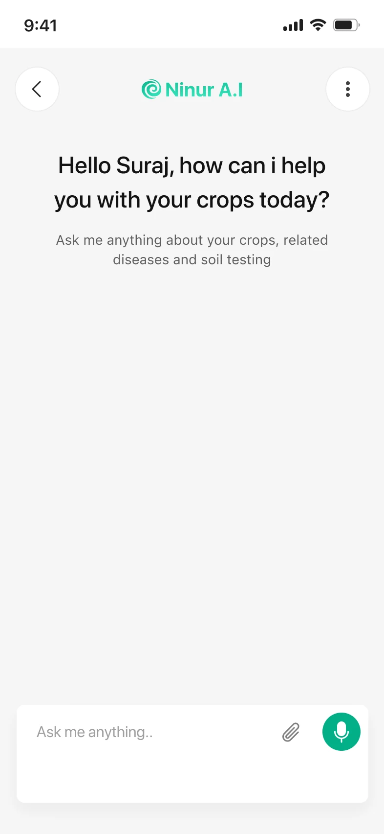
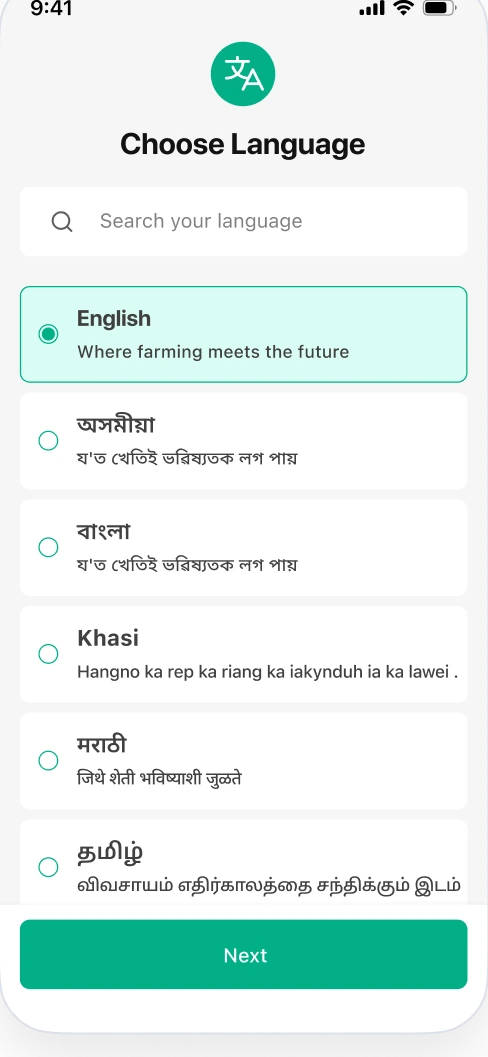
Choose language screen
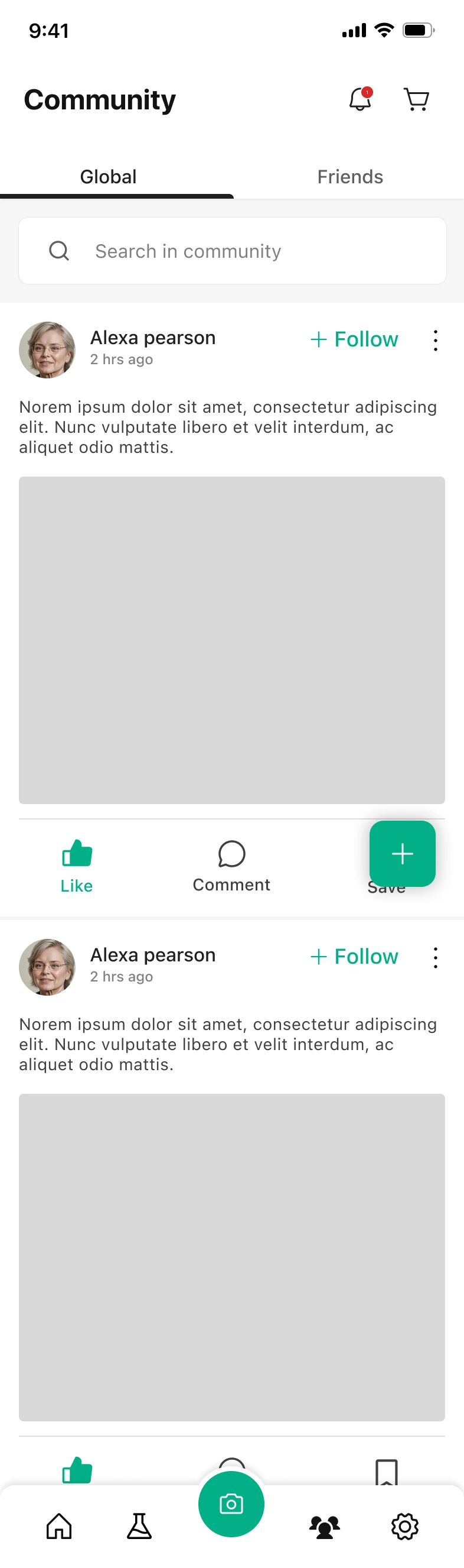
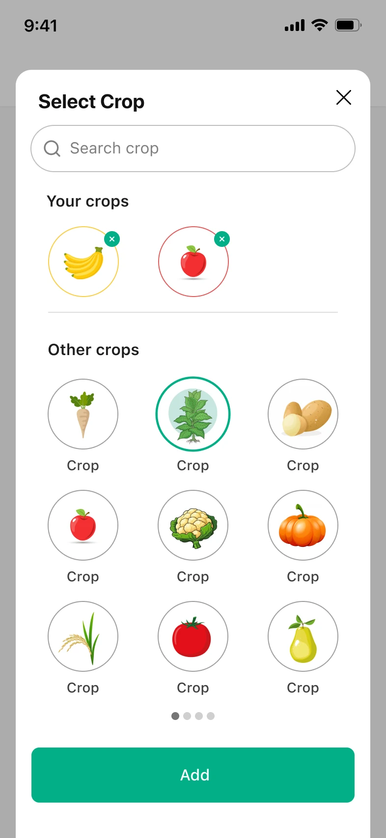
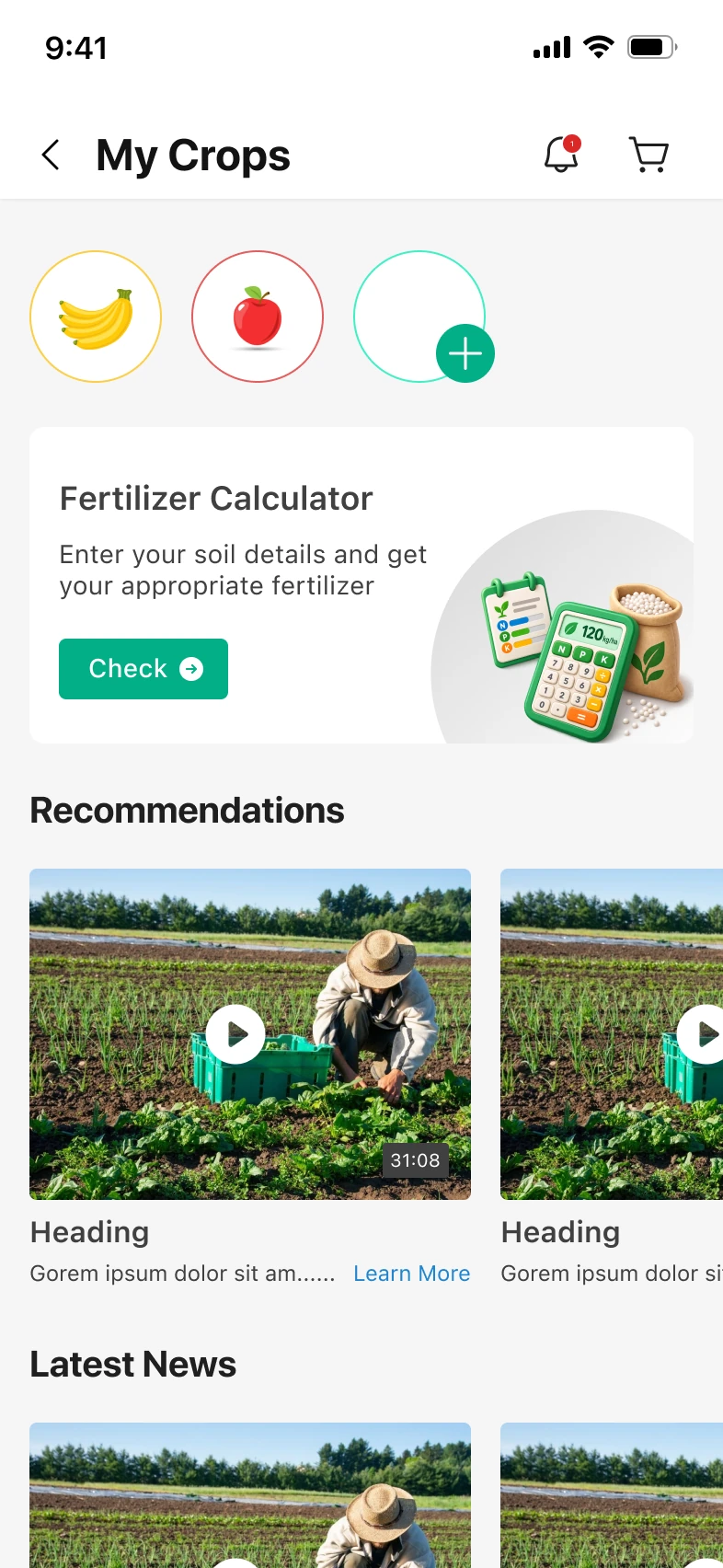
My Crops screen
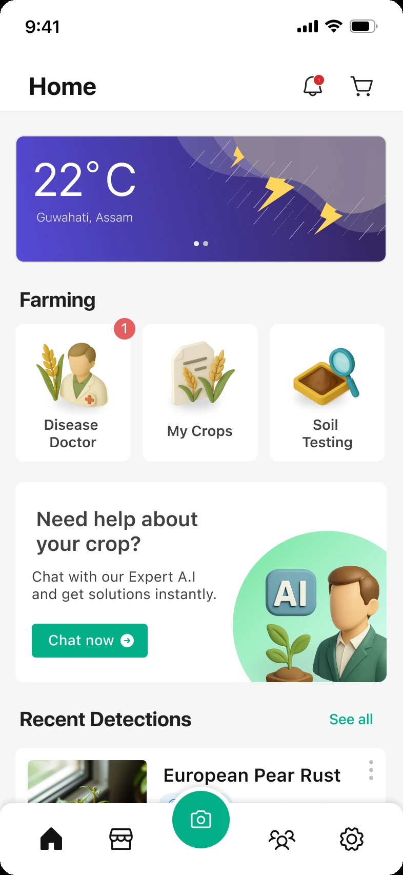
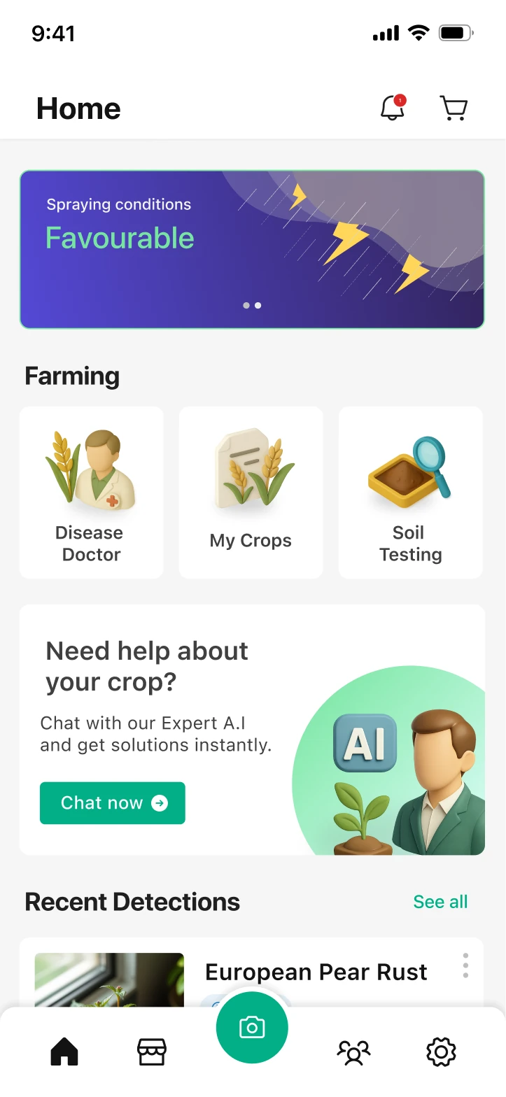
Home screen
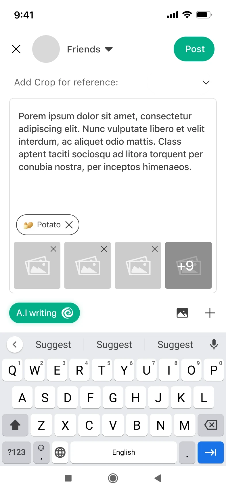
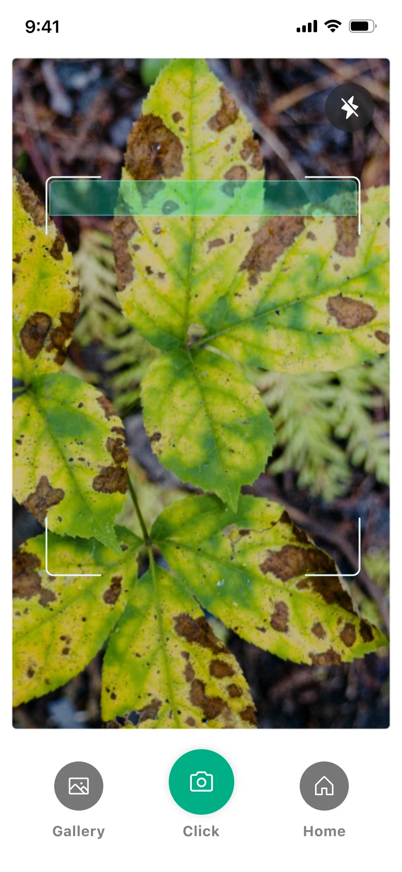
Scan screen
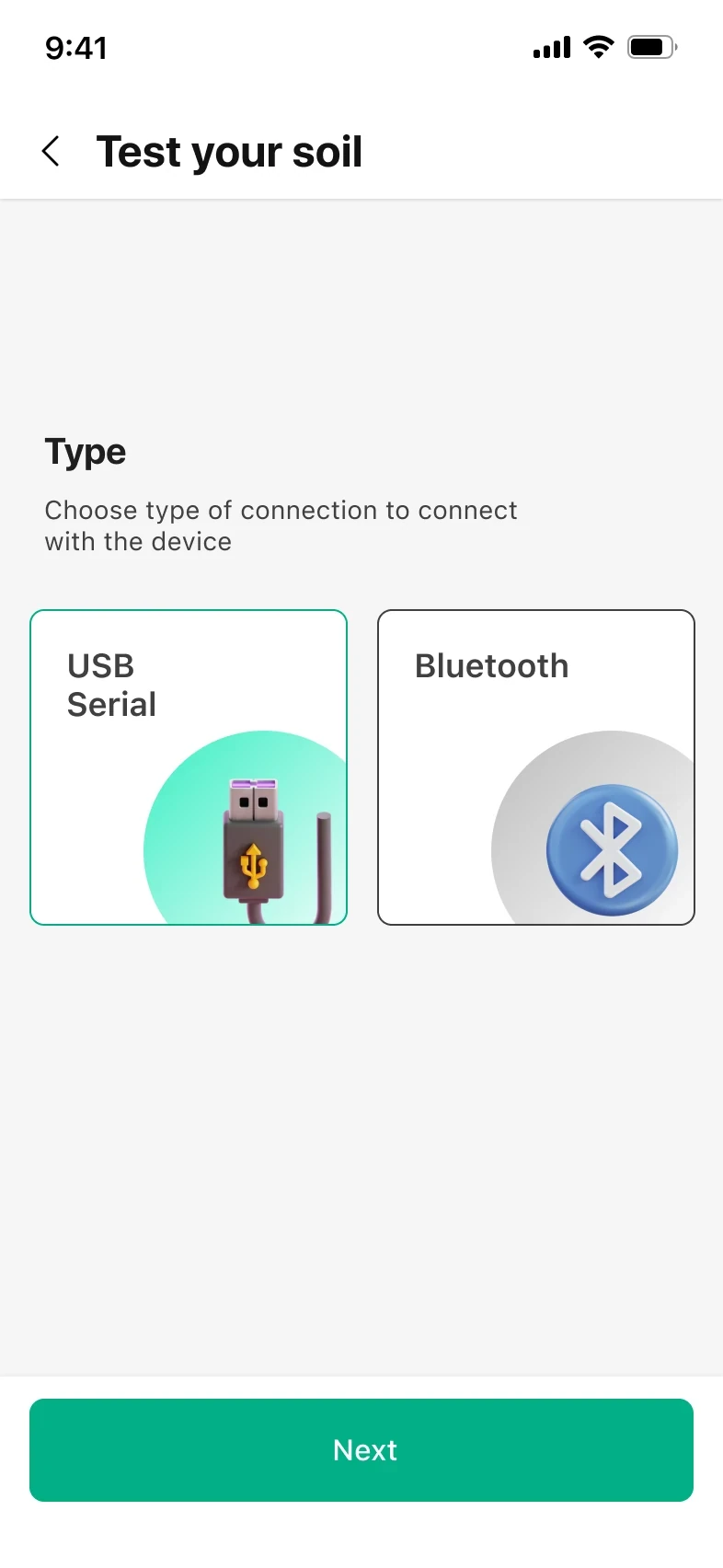
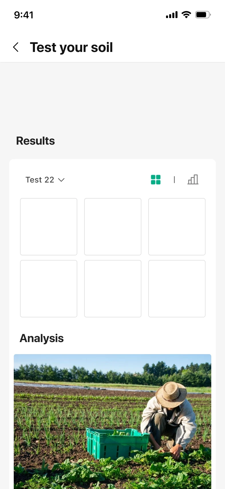
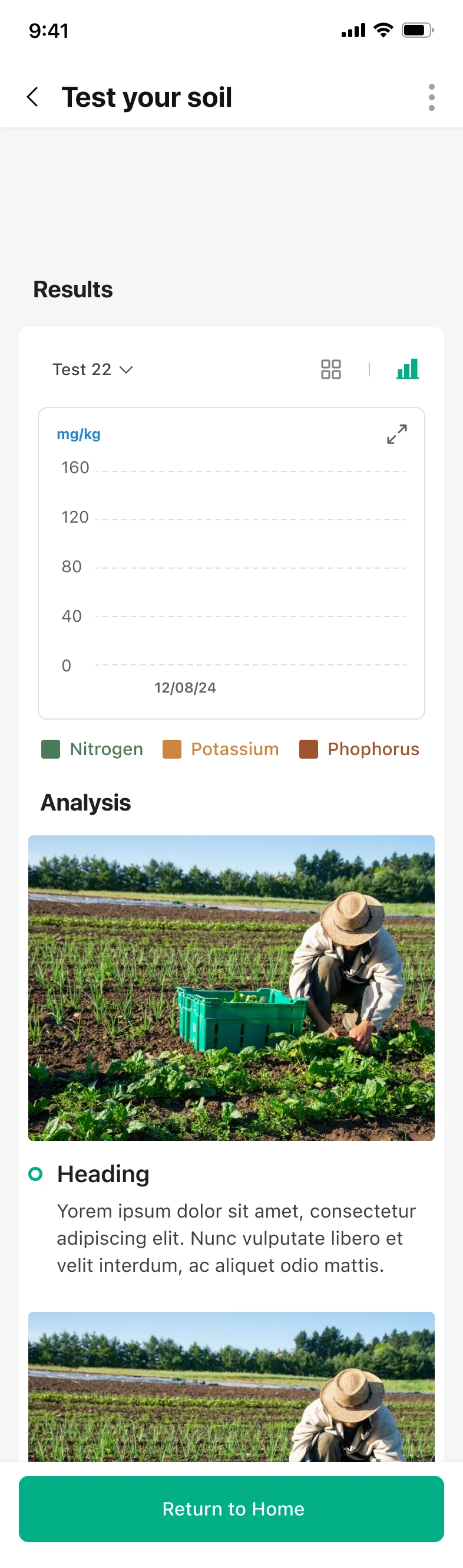
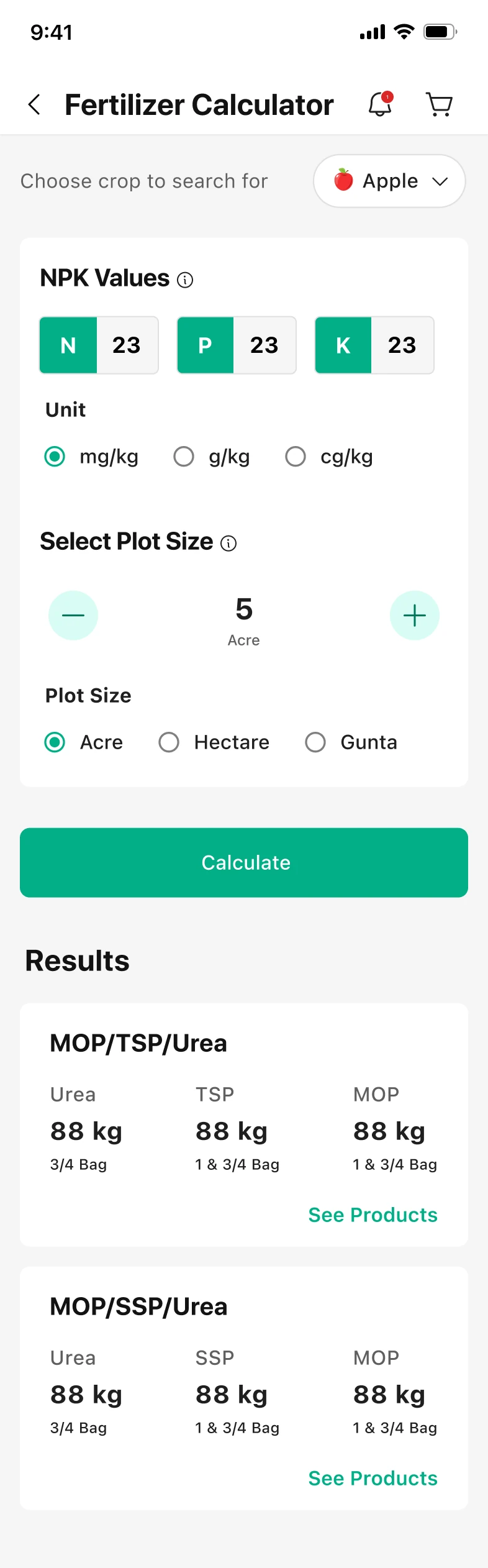
Fertilizer calculator results
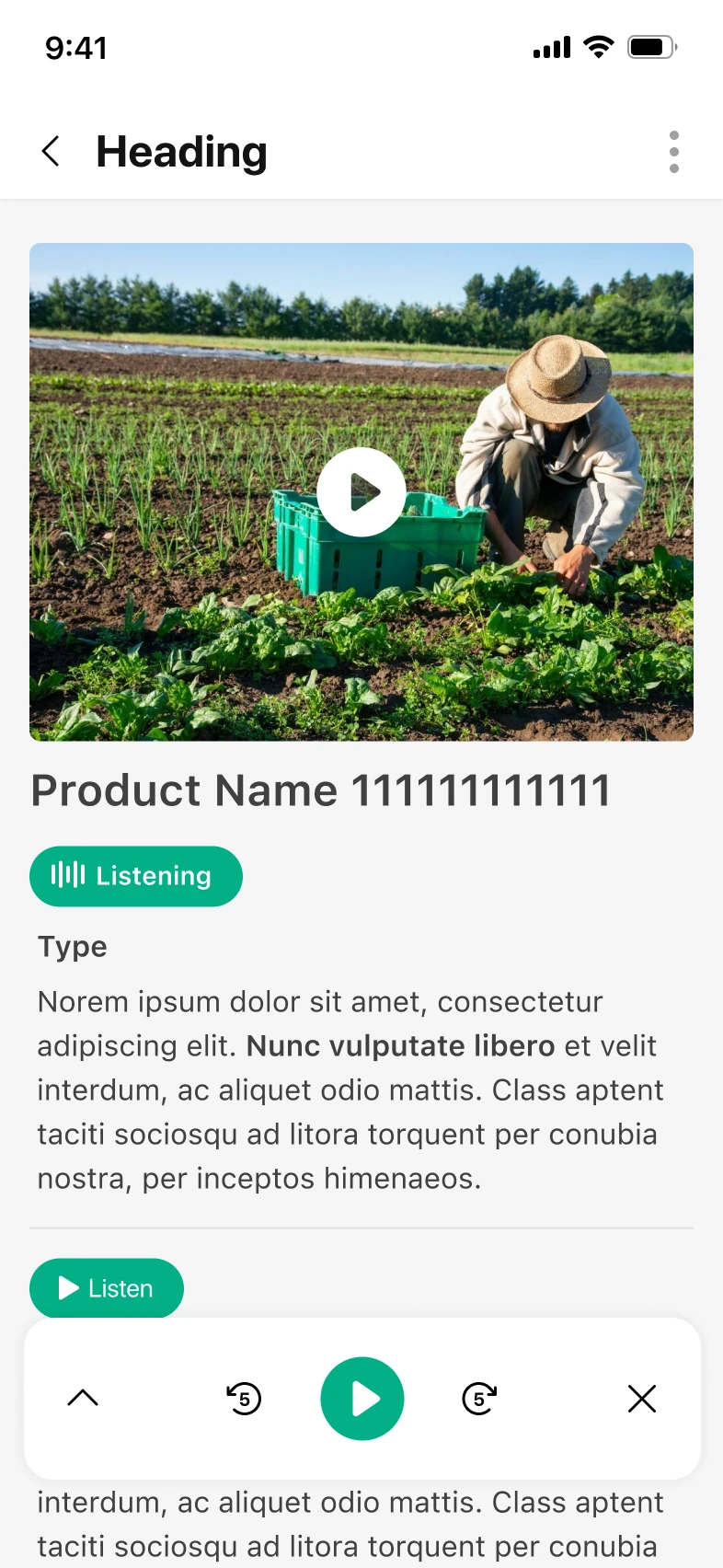
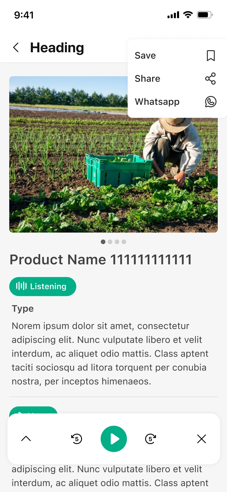
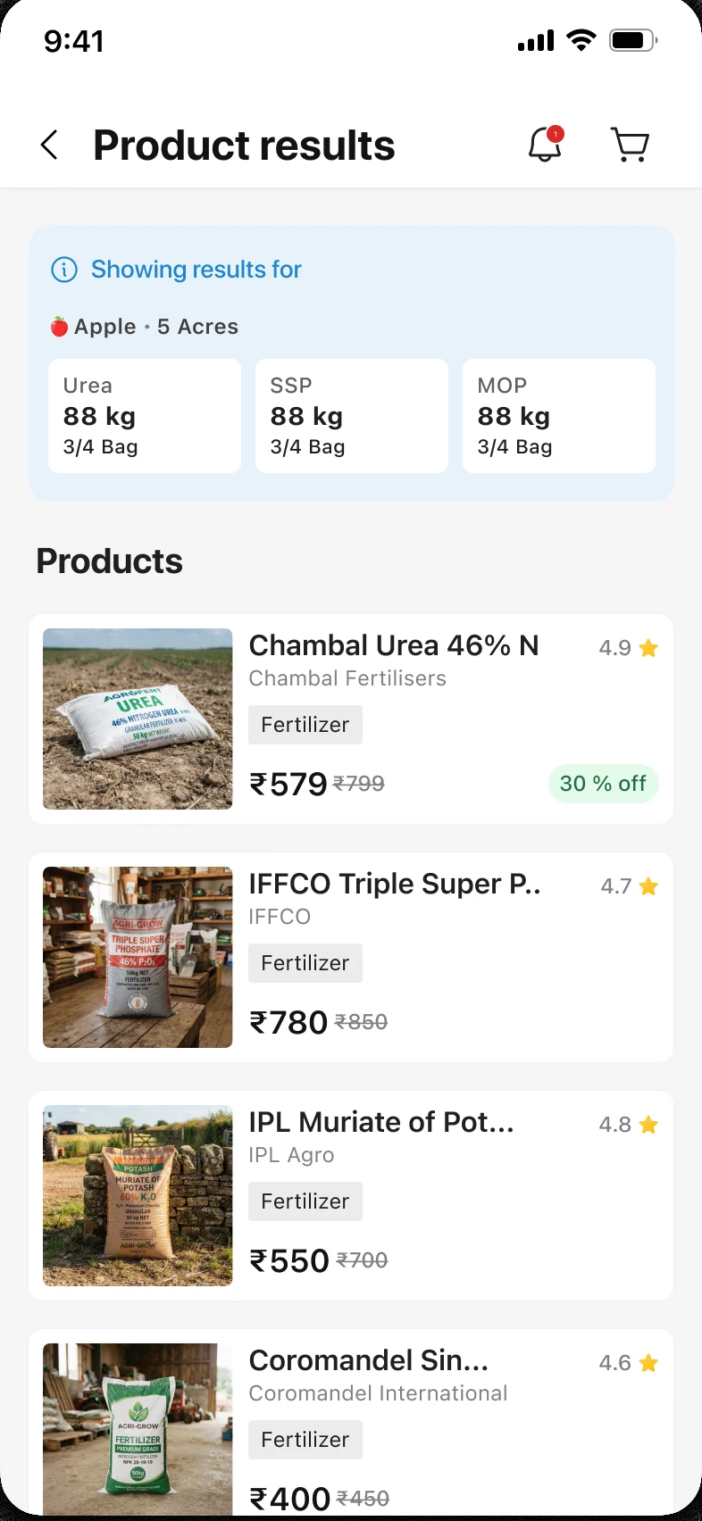
Product results screen

A glimpse of what I delivered…

Chapter 01

The app named the disease, then walked away.

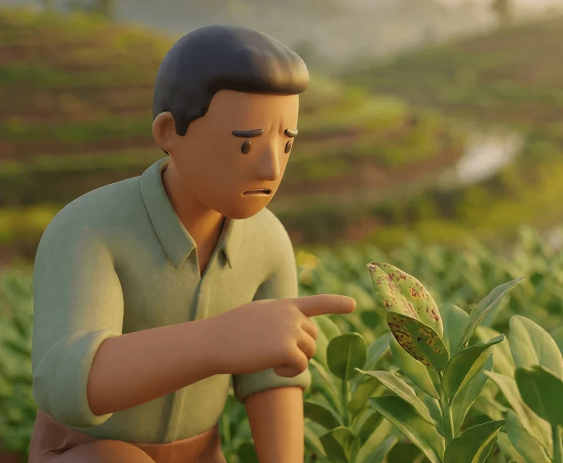
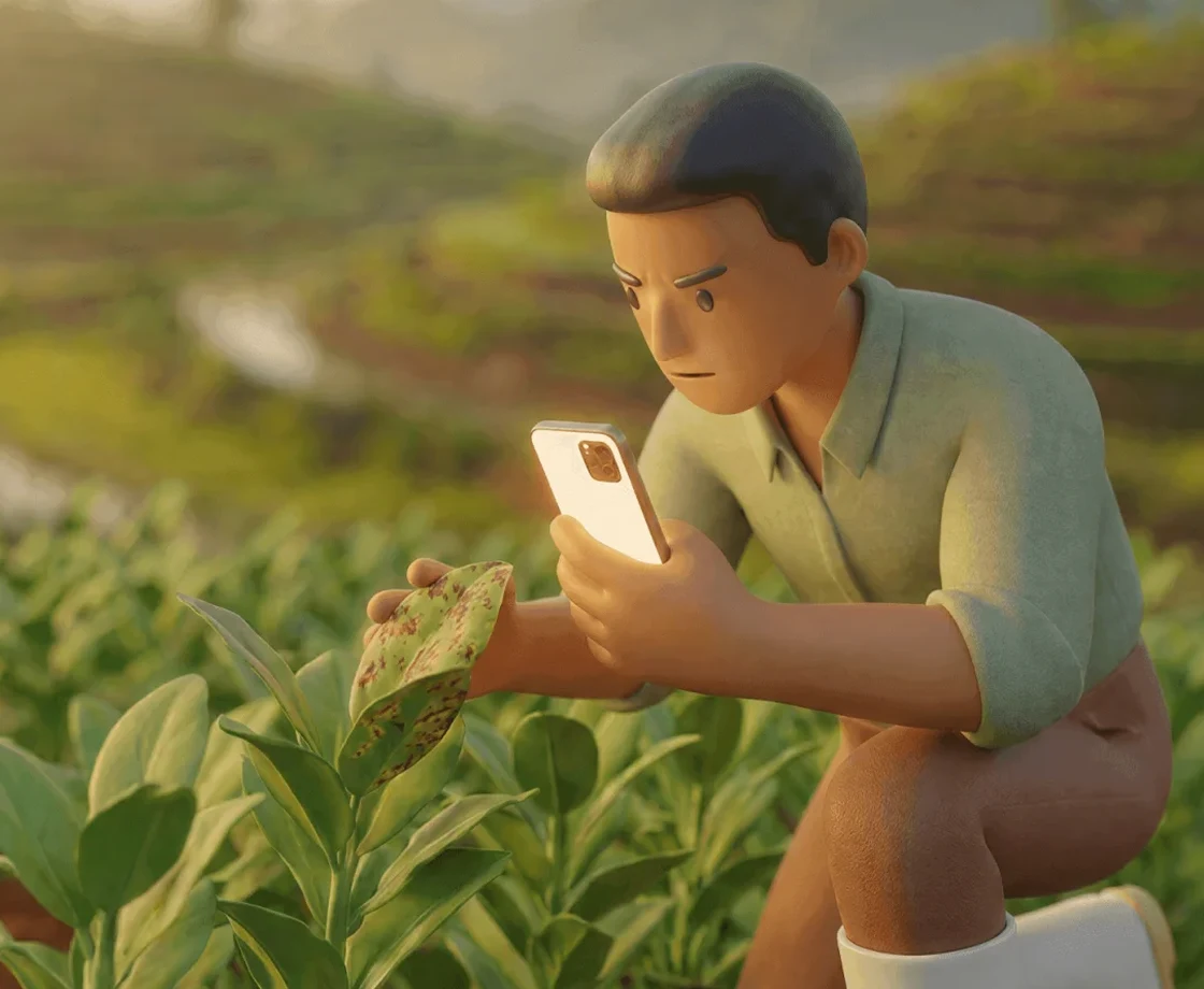
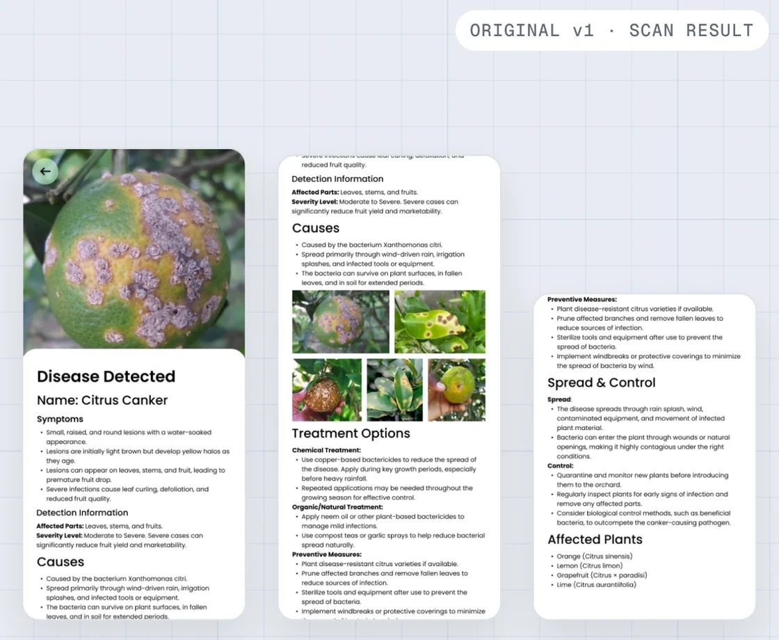
Hage points at a spotted leaf in his paddyHage scans the leaf with his phoneThe original v1.2 scan result screensHage sits outside, staring at his phone
  1. 01Something’s off.A leaf in his paddy looks wrong.
  2. 02Roughly one deep breath later…He scans it with Ninur.
  3. 03A name. And a wall of text.He reads it slowly, word by word.
  4. 04Now what?Nothing tells him what to do this week.

It told him what the disease was called. It never told him what to do.

Hage is a persona, built from 20+ pages of farmer surveys. That gap showed up in nearly all of them. And in the version I inherited, v1.2, the result screen didn’t exist at all. Ninur’s PM gave me the brief in one line:

“How might we redesign the app visually and improve the scan?”

To do that, I first had to understand Hage, without being able to visit a single farm.

Chapter 02

I couldn’t reach a farm, so I read everything.

22 surveys · 20 pages
SURVEY 01
SURVEY 02
SURVEY 03
SURVEY 04
SURVEY 05
SURVEY 06
SURVEY 07
SURVEY 08
SURVEY 09
SURVEY 10
SURVEY 11
SURVEY 12
SURVEY 13
SURVEY 14
SURVEY 15
SURVEY 16
SURVEY 17
SURVEY 18
SURVEY 19
SURVEY 20
SURVEY 01
SURVEY 02
SURVEY 03
SURVEY 04
SURVEY 05
SURVEY 06
SURVEY 07
SURVEY 08
SURVEY 09
SURVEY 10
SURVEY 11
SURVEY 12
SURVEY 13
SURVEY 14
SURVEY 15
SURVEY 16
SURVEY 17
SURVEY 18
SURVEY 19
SURVEY 20

Ziro is a long way from my college. I couldn’t visit a single farm.

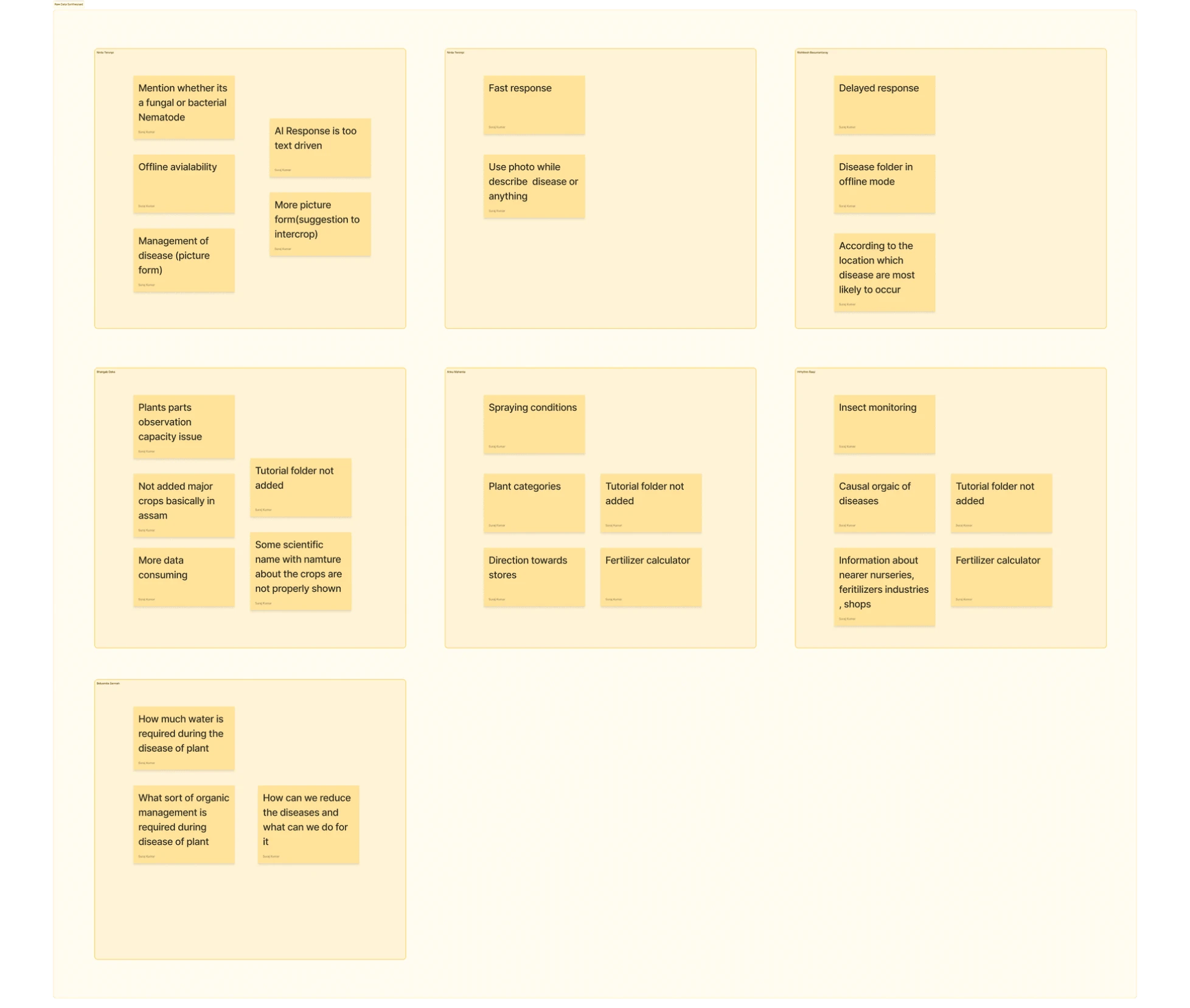
I read all 22 surveys the business team collected; many answers were half-filled or gibberish.

The farmers ranged from Millennials to Gen X, so the same question returned in very different ways. I filtered aggressively and then grouped the remaining responses by affinity.

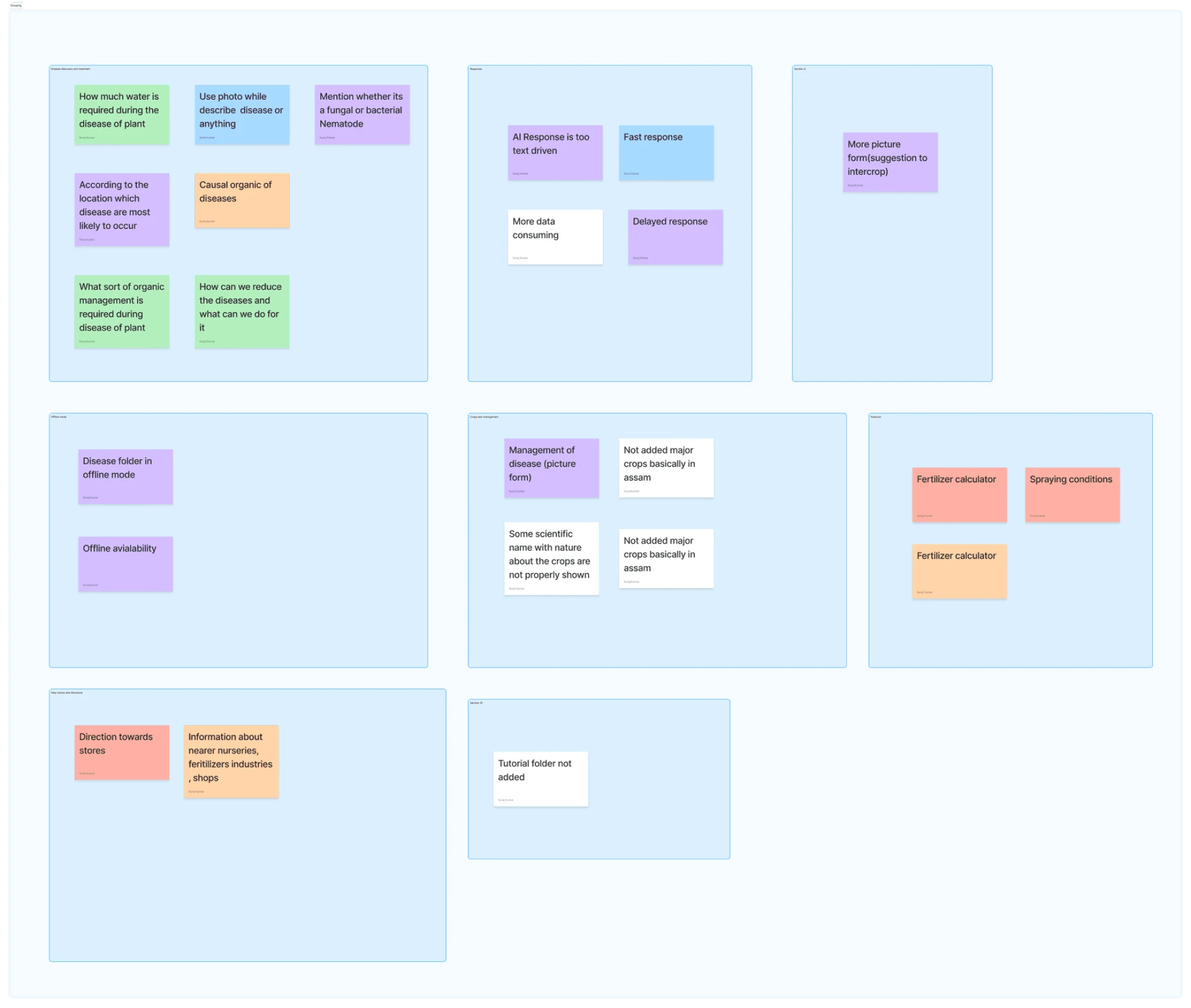
Step 1 · Raw · 22 surveys, by farmerAll 22 survey answers as sticky notes, one box per farmerThe same notes regrouped by theme
Every answer, as it came in. One box per farmer.Same notes, regrouped by meaning. Patterns start to show: cure, pictures, offline, nearby shops.
What the surveys told me
Takeaway 01

The app named the problem. Farmers wanted the cure.

Every disease note asked for the next action, not a better label. It was the clearest signal on the wall.

Takeaway 02

Text was the wrong medium. Farmers wanted visual aid.

The repeated ask for pictures over paragraphs wasn’t a style preference. It showed who the app was really for.

Takeaway 03

Place and connectivity were the context.

Offline access, local crops, location-aware advice and directions to real shops all pointed to one grounded user.

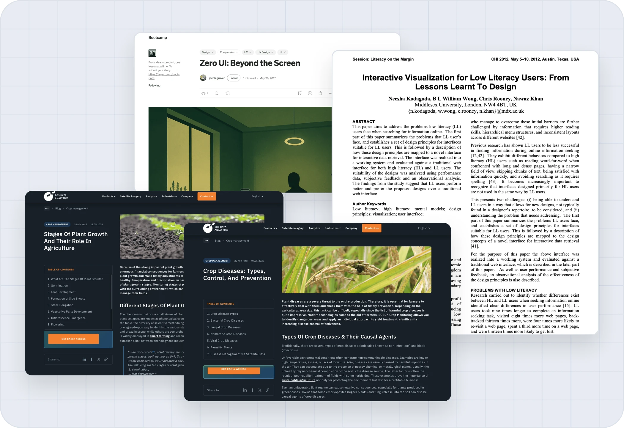
Where the surveys went quiet, I read: how low-literacy users read a screen, how crop disease actually works, and how crops grow week by week.

Layered collage of design papers on low-literacy reading, plant pathology and agronomy

Design papers on low-literacy reading, plant pathology and agronomy.

What the reading told me
Takeaway 01

How low-literacy users actually navigate

They don’t scan; they read every word. One dead end and they’re trapped, so no deep menus.

Takeaway 02

How crop disease actually works

“Plant disease” isn’t one thing. Fungal, bacterial, viral and environmental issues follow different rules.

Takeaway 03

Diagnosing by sight, not science

Farmers notice a strange mark on a leaf, not a pathogen. So the app should be organised around plant parts.

Takeaway 04

Crop stage: what the plant is doing now

A seven-stage model, put in a farmer’s words, with one clear action for each week.

Takeaway 05

Voice and instant feedback

Voice lets him ask instead of type, and an audio-visual cue on every tap means no dead ends.

Chapter 07

Architecting the app

Five tabs, with Scan up front beside the rest.

Scanning is the primary action, so it sits in the tab bar with Home, Store, Community and Settings. Deeper screens drop the tab bar and rely on back buttons, so a misclick can’t send anyone somewhere else.

The app flow

Five tabs, and where each one leads

A tag marks a screen that leads into another branch.

On paper

Then I put it on paper.

Only a pen, because speed mattered on this timeline. Rough drafts, reworked one iteration at a time.
Chapter 08

The design

With the structure set, I designed for Hage.
Pictures before paragraphs, the cure before the name, and nothing that needs a strong signal. This chapter covers the design language and the six flows built on it.
Introducing Ninur

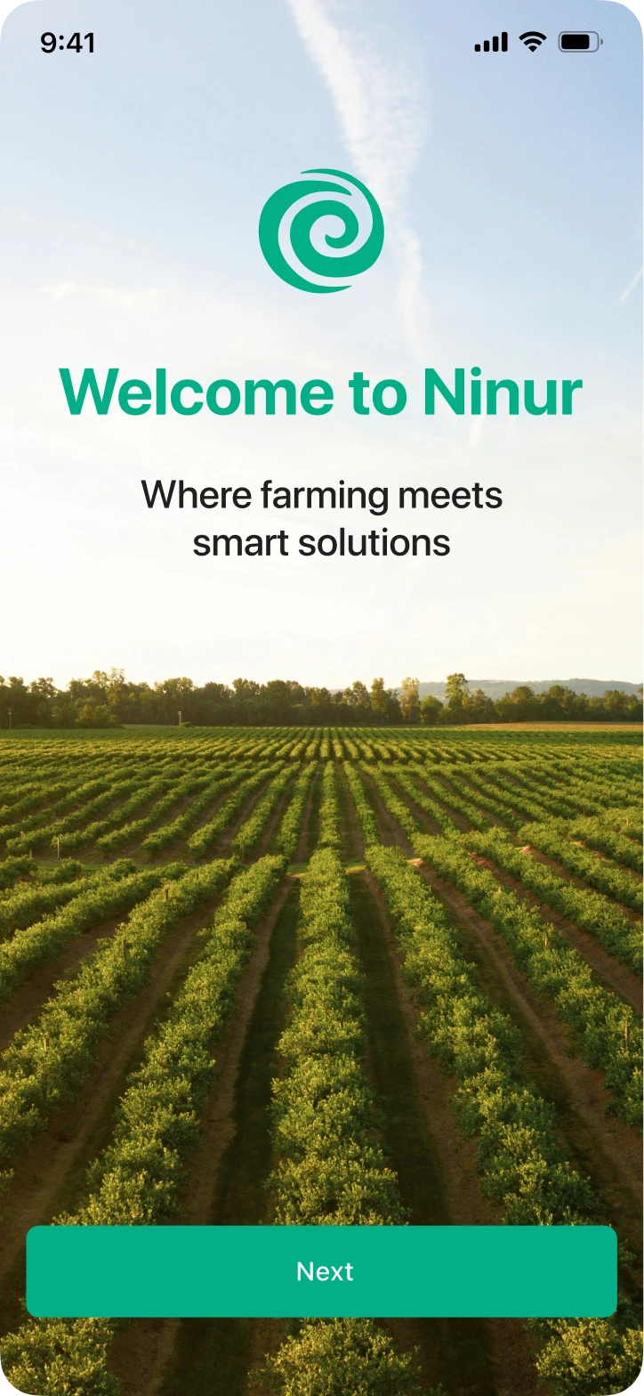
The app Hage opens when his crop looks wrong

Key decisions
Onboarding

Phone OTP, not Google-only login

Plus the local languages farmers actually speak.

Treatment

Audio in his language

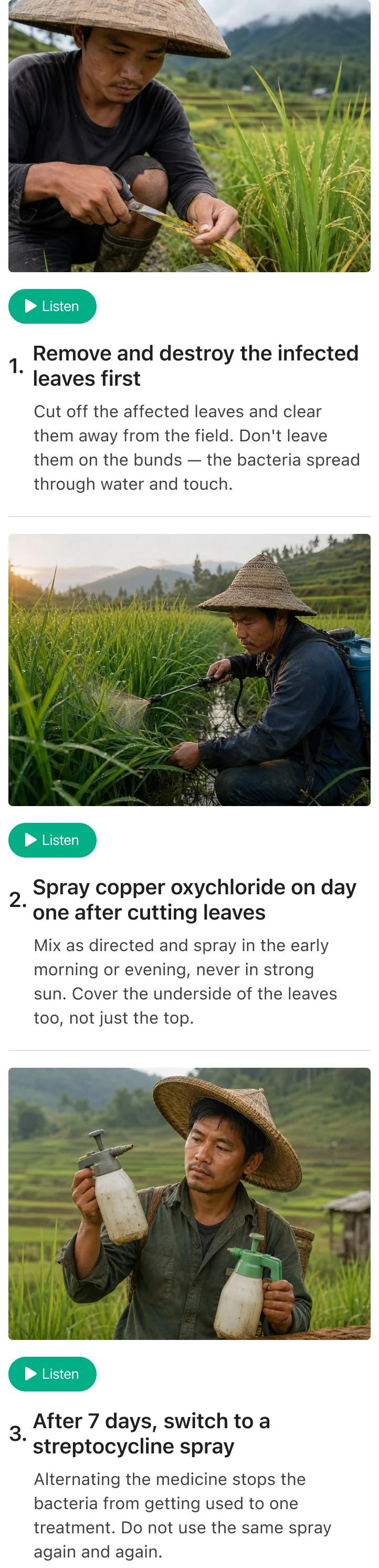
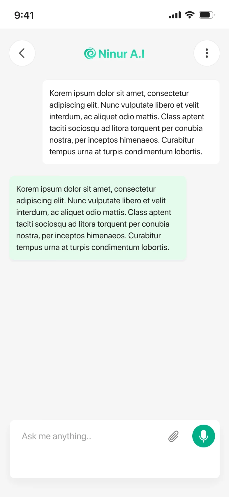
Each step pairs an action with a picture, and the audio plays in the language he chose during onboarding.

Offline

Disease folders that work without signal

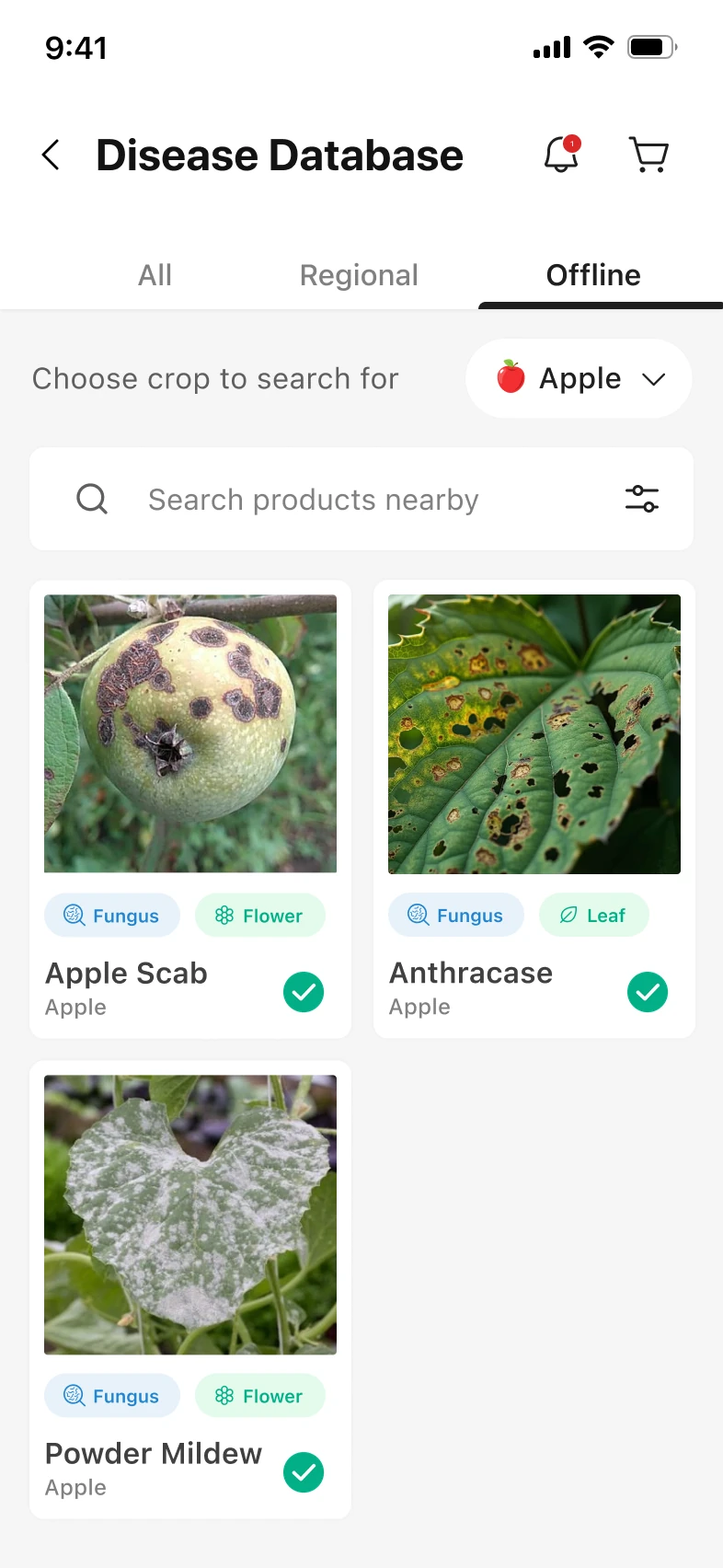
Scans save automatically, and he can save diseases by crop before the season starts.

Store

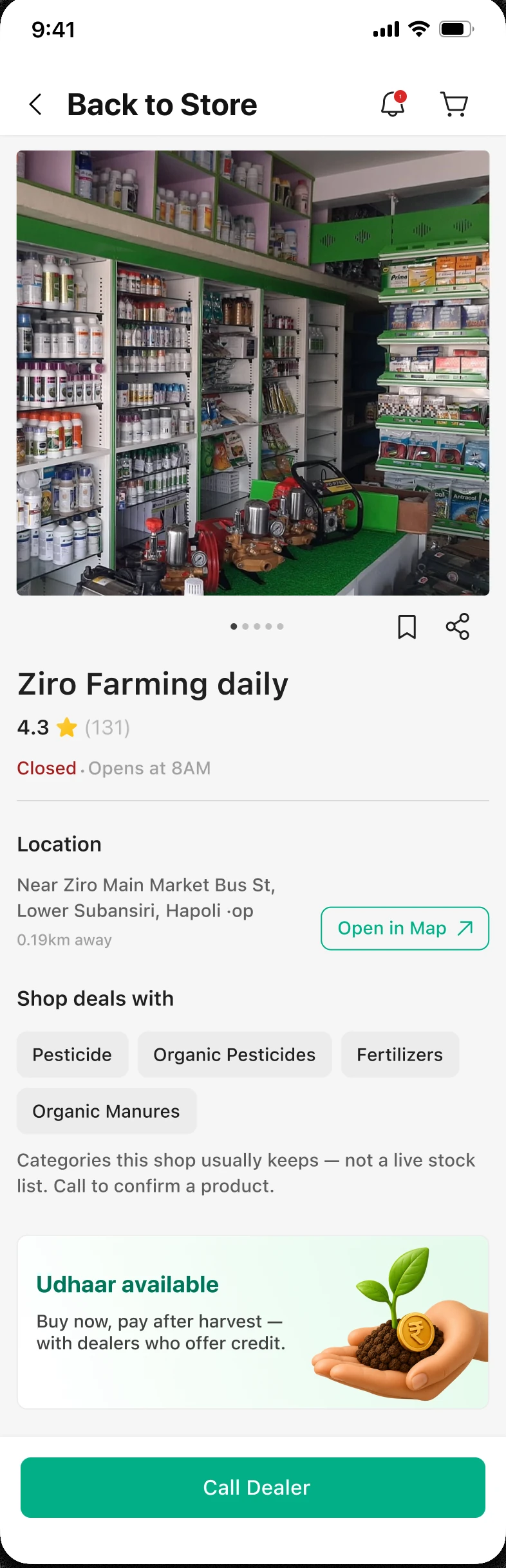
Udhaar on the dealer page

Buy now, pay after harvest. That is how rural commerce already works; the app simply surfaces it.

The style sheet

A style sheet instead of a full design system

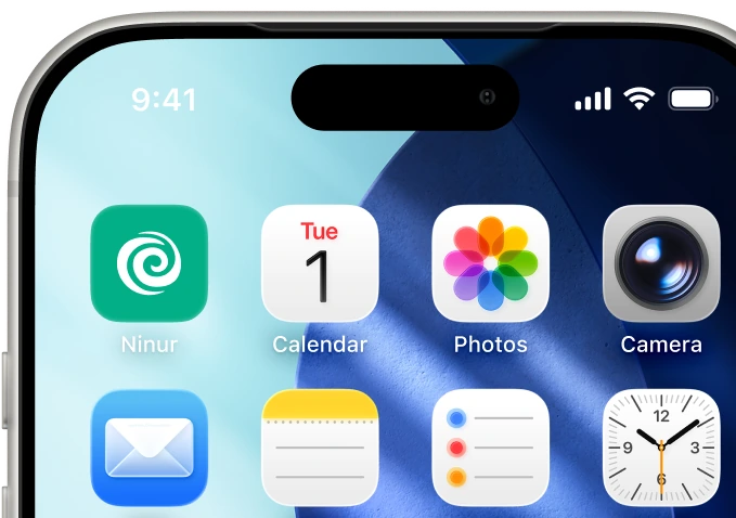
Ninur app icon on an iPhone home screen
Colors/typography SF Pro FamilySF Pro TextSF Pro Display 101214161820202436485664

Light Mode

Dark Mode

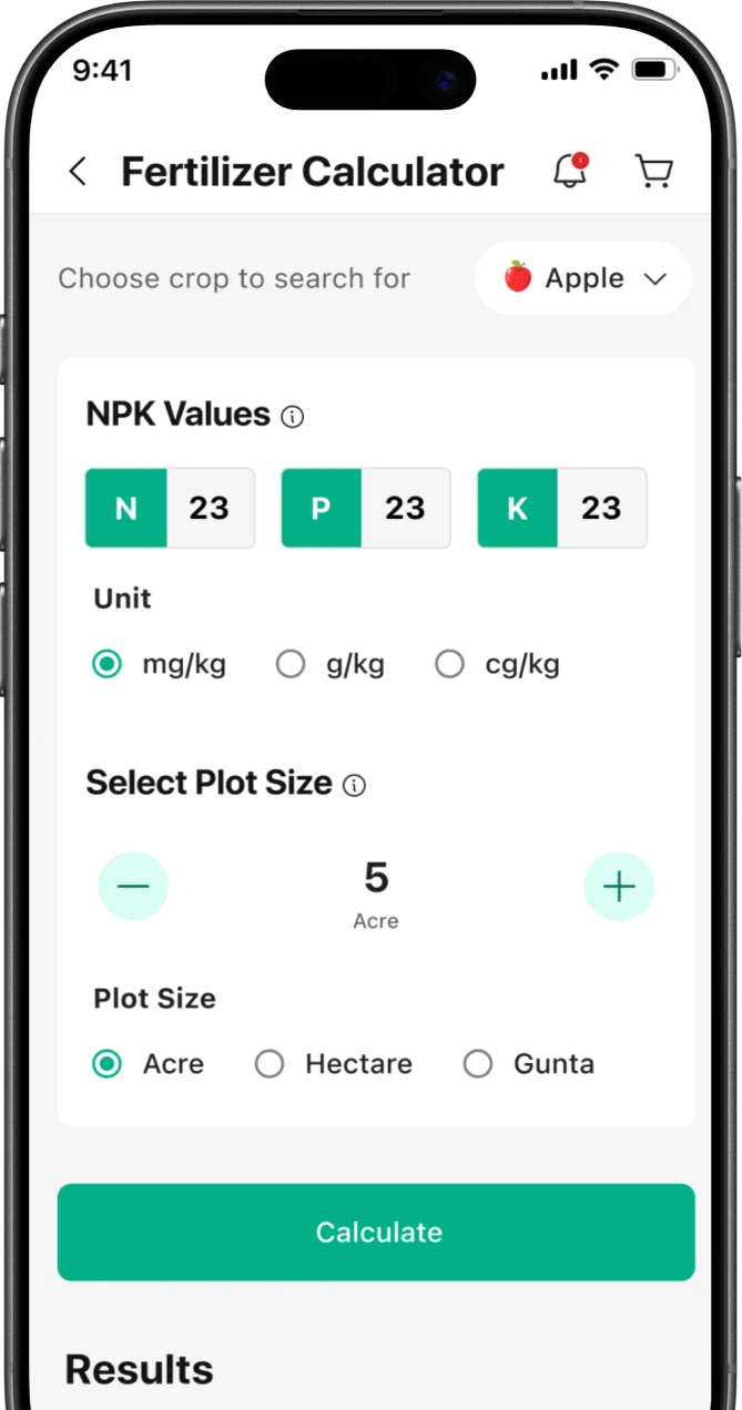
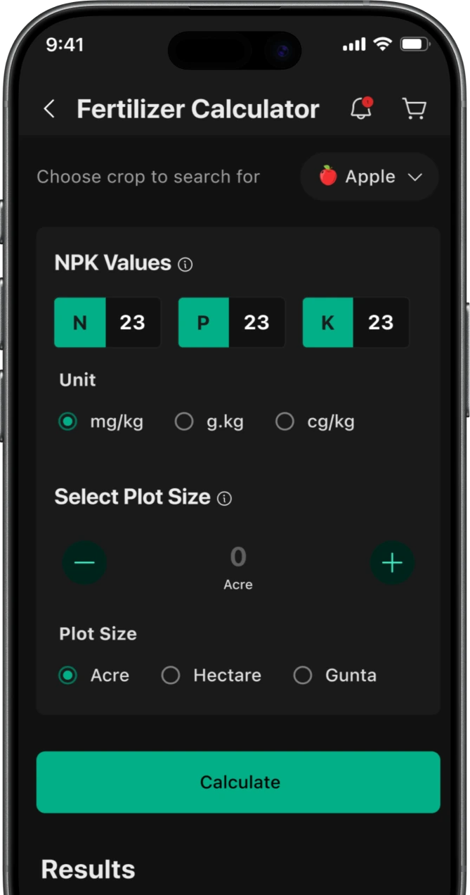
Fertilizer calculator in light mode Fertilizer calculator in dark mode
Light and dark

What I built is the base: a style sheet and structure meant to grow into a design system as the product matures. I set it up with variables, so light and dark mode both come for free with little tweaks, ready to scale whenever they need it.

I built what the app needed to ship: a style sheet and a state-first component library. A fully documented design system wasn’t the priority. Consistent, reusable UI that worked for Hage was.

Logo and icons

A logo that scales, and icons that feel real

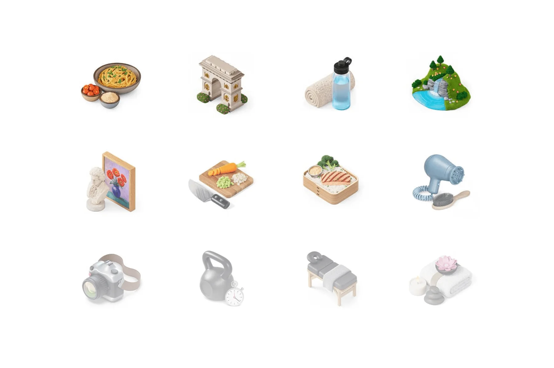
While working on the app, I improved the logo and set up a proper structure for the design language. Browsing the internet, I settled on Airbnb-style realistic icons, which are realistic yet simple.

The old Ninur logoOld logo
The new Ninur logoNew logo
Twelve realistic 3D-style icons

To replicate the Airbnb 3D-style icon, I rebuilt it and wrote JSON code that yields similar results. I can use it for Ninur and it helps the developer team. I also set up a proper context and structure so they can generate any icon in the future.

See the code

Major user flows and decisions

Flow 1 · Onboarding

Sign up with just a phone number

    Fixing the login roadblock

    We replaced the Google-only login with a simple phone OTP and added the local languages that farmers actually speak.

    Data that actually matters

    We replaced random data grabs with two simple questions, what they grow and where they live, to instantly personalize the app.

    Flow 2 · Diagnosis and treatment

    From a photo of the leaf to a treatment plan

    Hage notices something wrong with his crop. He taps the camera, clicks a photo of the leaf, and gets a diagnosis in seconds.

    Ninur home screen
    Scanner
    Diagnosis details
    Treatment plan steps
    Flow 3 · Fertilizer calculator

    Plot size in, bag count out

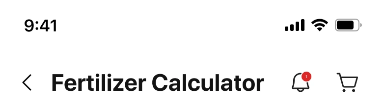
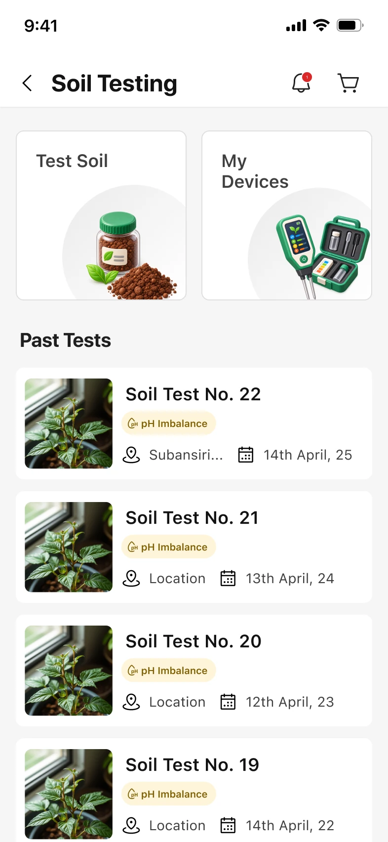
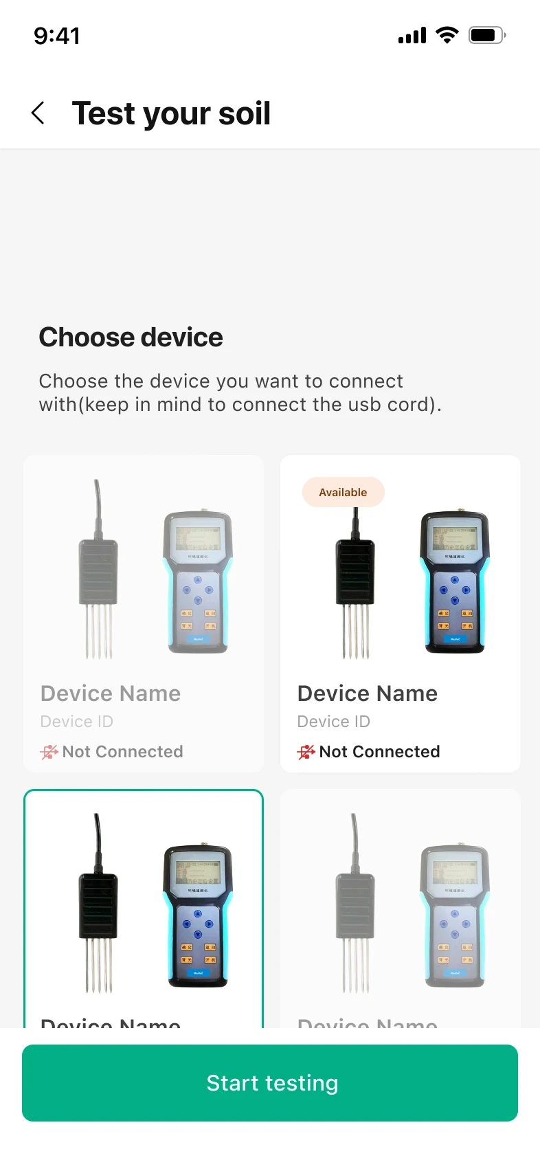
    Hage has his soil-test results and needs to know how much fertilizer to buy. He picks his crop, enters the values and plot size, and gets a bag count.

    Fertilizer calculator
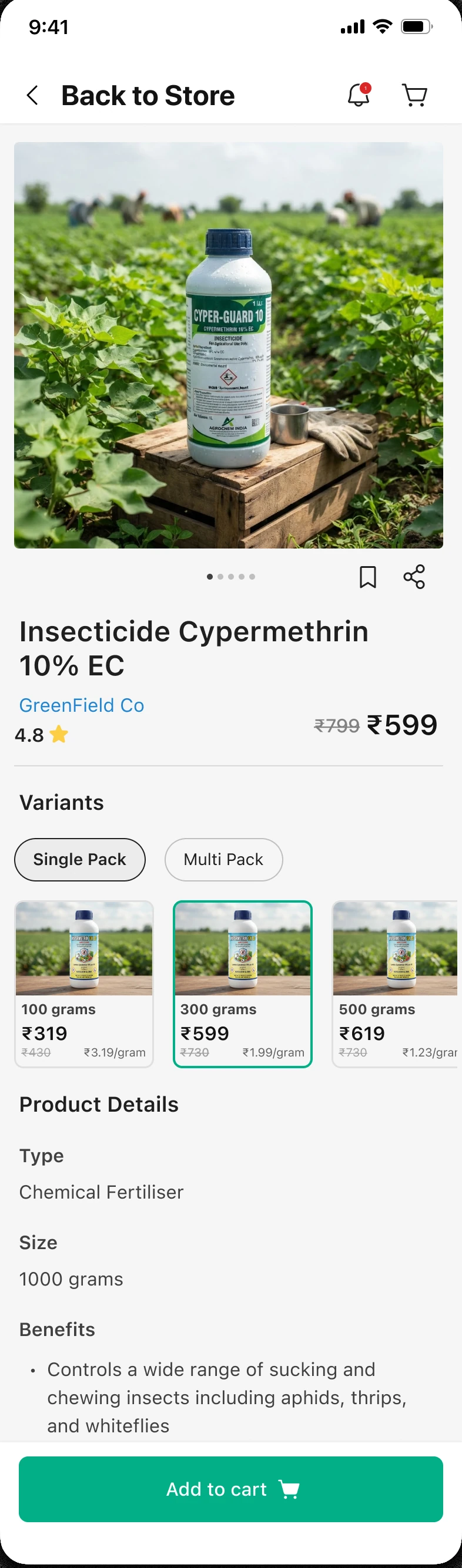
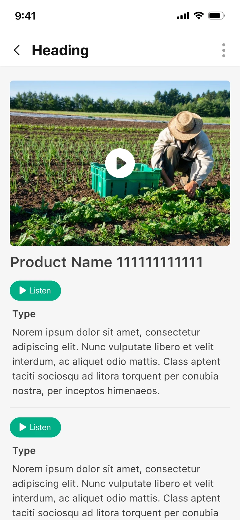
    Product results
    Flow 4 · Offline mode

    Disease info that works without signal

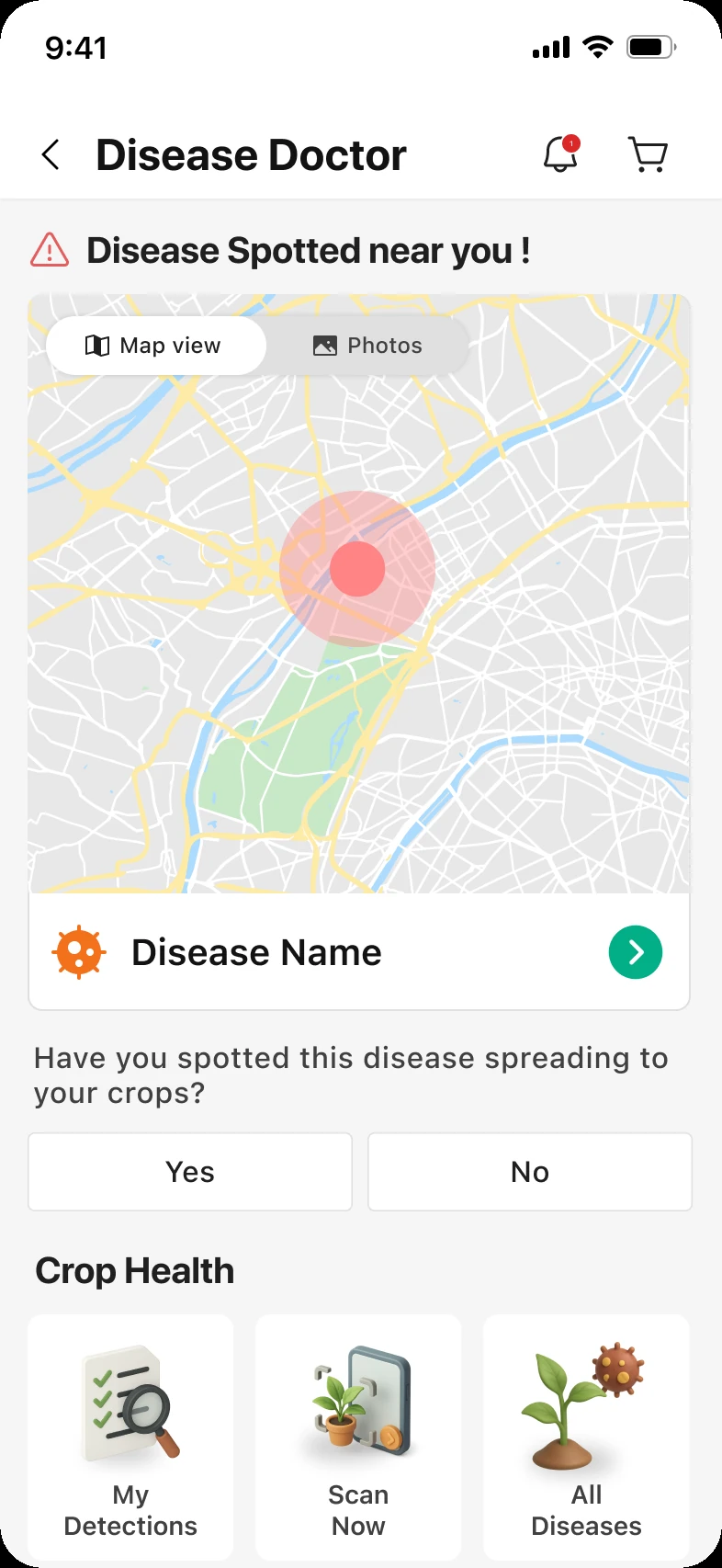
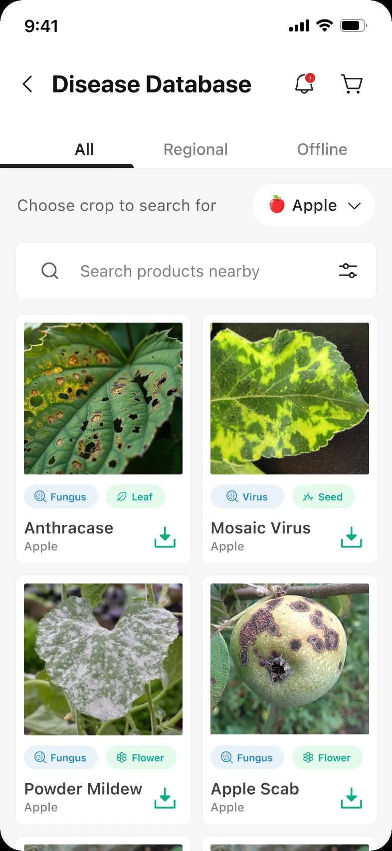
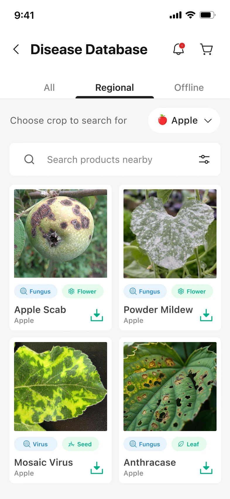
    Hage opens Disease Doctor to see what’s spreading near him. He can report a disease with one tap, and save diseases to read without signal.

    Ninur home screen
    Disease Doctor
    Disease Database
    Disease Database, Regional tab
    Disease Database, Offline tab
    Flow 5 · Store

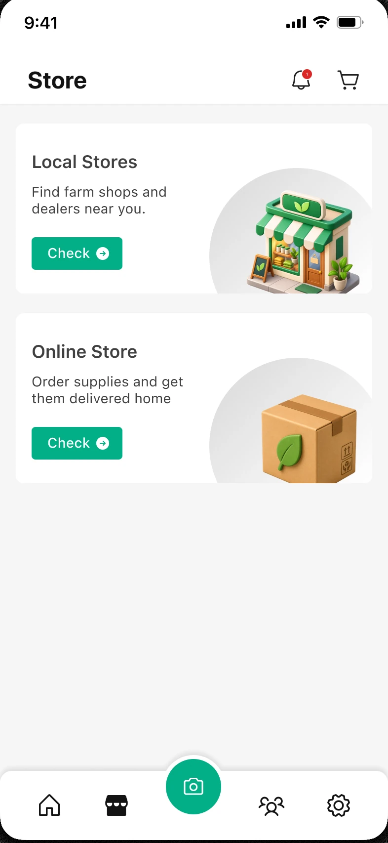
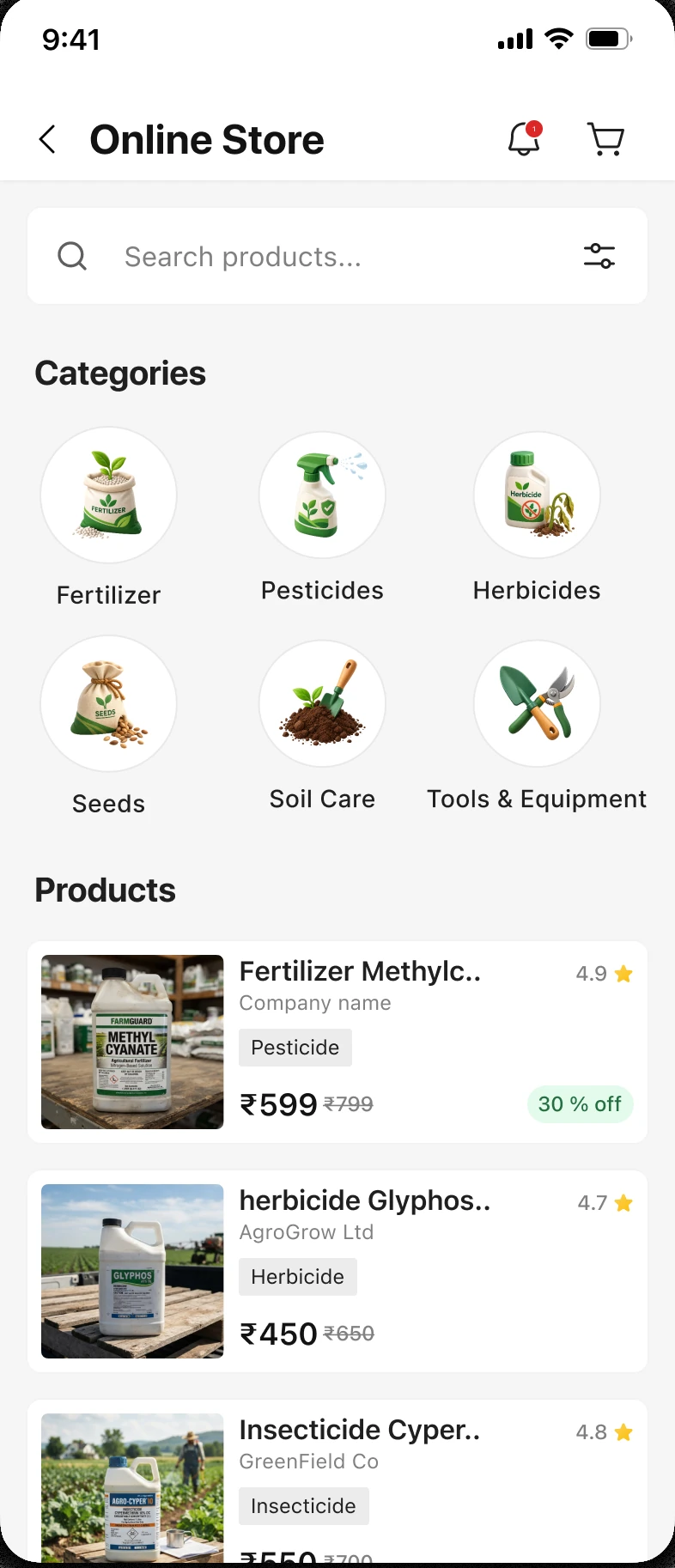
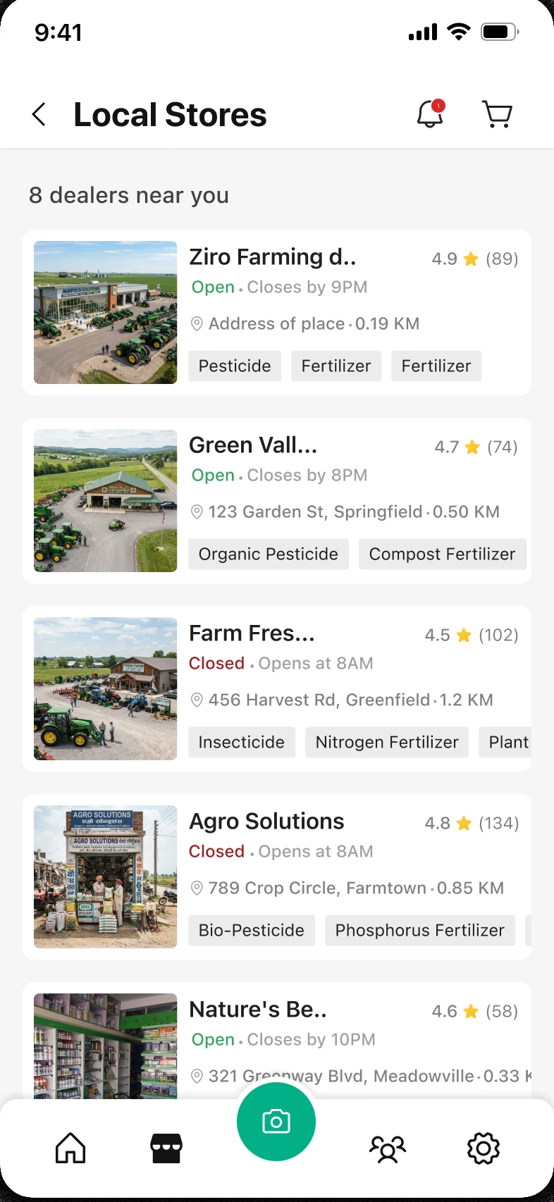
    Online delivery or a local dealer, in one layout

    Hage needs supplies. He can order them online, or find a dealer near him and call.

    Store
    Online Store
    Product page
    Local Stores
    Dealer page
    Chapter 09

    What shipped, and what it taught me

    The design shipped, and the Ninur team adopted it.

    They built their model and app on top of it. I don’t have post-launch numbers, so instead of manufacturing metrics, I’ll share what I learned and what I’d measure next.

    What I’d measure next

    Three numbers I don’t have yet

    Each one maps to a call I made in Chapter 08. None is measured yet, so none has a figure.

    Goal · not measured yet

    Scans that end in a next step

    How often a diagnosis is followed by the treatment plan, not by closing the app.

    Goal · not measured yet

    Sign-ups that finish

    How many farmers get through the phone OTP and the two questions.

    Goal · not measured yet

    Use with no signal

    How often the offline disease folders are opened where the network drops.

    What it taught me

    Five things I’d carry into the next project

    1. Systems

      A style sheet built to scale

      A full design system would have blocked the team, so I handed off a lightweight UI kit, consistent enough to grow, fast enough to build on today. Match the artifact to the team’s stage.

    2. Content

      Photos over illustration

      Real photos read faster and AI-generate at scale, a cheap, expandable pipeline.

    3. Product

      Beyond screens: ideation and strategy

      I worked with dev and product to shape engagement strategies, not just visuals. On a small team, the interface should follow product thinking.

    4. Craft

      A logo that scales

      Not a rebrand. A rework into a mark usable across platforms. Refine, not redo.

    5. Users

      Ruthless simplicity

      Fewest steps, least reading. Success was a farmer getting through without getting lost.